The terms “dispersion,” “variation,” and “spread” are interchangeable and describe how dispersed or dispersed a set of data is around its central tendency (such as the mean); in other words, they describe the degree of variability within a dataset, or how much the data points deviate from the average value and from one another.
1. Sample Standard Deviation
The standard deiation is a measure of the amount of variation of the values of a variable about its mean. It is given as

where
- x̄ = sample average
- x = individual values in sample
- n = count of values in the sample
- s = sample standard deviation
sd(mtcars$mpg) # Standard deviation
2. Sample Variance
The sample variance is approximately the average squared distance of the observations from the sample mean. The SD & variance are sensitive to extreme values.

var(mtcars$mpg) # Variance
The variance is just the square of standard deviation s & the standard deviation is square root of variance.
sqrt(var(mtcars$mpg) # Standard deviation
sd(mtcars$mpg)^2 # Variance
Box plot
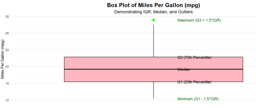
A box plot is a great tool to interpret variance. A clear vertical box plot shows
- Median (black line inside the box),
- Interquartile Range (IQR, the box itself),
- Whiskers extending to Q1−1.5×IQR and Q3+1.5×IQR,
- Outliers clearly marked in green.

A simple box plot can be made using a boxplot() in base R with necessary graphical parameters.
boxplot(mtcars$mpg,
main = "Boxplot of MPG (Miles Per Gallon)", # Title of the boxplot
xlab = "Miles Per Gallon (mpg)", # X-axis label
col = "skyblue", # Fill color of the box
border = "black", # Border color of the box
horizontal = TRUE, # Makes the boxplot horizontal
notch = TRUE, # Adds a notch to highlight the median
outline = TRUE, # Shows the outliers
whisklty = 1, # Line type for whiskers (solid)
staplewex = 1, # Width of the whiskers/staples
medlty = 1, # Line type for the median (solid)
medcol = "red", # Median line color
medlwd = 2, # Median line width (thickness)
boxwex = 0.6) # Width of the box
What to interpret from a box plot?
We can analyze the following key components when looking at a box plot:
i. Median (50th Percentile):
- The bold line inside the box.
- Represents the middle value when data is sorted.
- Helps understand the center or “typical value” of the dataset.
ii. Interquartile Range (IQR):
- The length of the box (Q3 − Q1).
- Represents the spread of the middle 50% of the data.
iii. Whiskers:
- Lines extending from the box to the smallest and largest values within the 1.5 × IQR range.
- Shows how far the data extends without outliers.
iv. Outliers:
- Points outside the whiskers.
- Indicates extreme values that may need further investigation.
v. Skewness:
- If the median line is not centered in the box, it indicates skewness.
- Left-skewed: Median closer to Q3; longer left whisker.
- Right-skewed: Median closer to Q1; longer right whisker.
vi. Symmetry:
- If the box is symmetric and whiskers are of similar length, the data is symmetrically distributed.
vii. Range:
- The total spread of the data (Minimum to Maximum, including whiskers).
viii. Comparison:
- When multiple box plots are shown side by side, we can compare:
- Centers (medians),
- Spreads (IQRs),
- Outliers,
- Skewness.
3. Interquartile Range (IQR)
IQR is the difference between q0.75 & q0.25 i.e. q0.75 – q0.25. IQR is resistant to outliers, robust to non-normality & easy to explain.
IQR(mtcars$mpg)
4. Mean Absolute Deviation (MAD)
MAD is much more robust than IQR. MAD = c*median(|x1 – x͂ |, |x2 – x͂ |, … , |xn – x͂ |), where c is a constant chosen so that the MAD has nice properties. The value of c in R is by default 1:4286.
mad(mtcars$mpg)
5. Coefficient of Variation (CV)
The CV is equal to standard deviation divided by mean, multiplied by 100%. The CV shows the relation with respect to mean (center point). It is useful when comparing two or more sets of data. The CV is useful for assessing the degree of variation between data series, even if the means are vastly different.
Here is an example on daily returns of two stocks. A “daily return on a stock” is the percentage change in a stock’s price from the previous trading day’s closing price to the current trading day’s closing price, essentially measuring how much the stock price increased or decreased in a single day. A positive daily return indicates that the stock price increased, while a negative return indicates that it decreased.
stock_A <- c(3, 5, 4, 6, 8, 4, 3, 7, 6, 5) # Daily returns for Stock A
stock_B <- c(7, 9, 12, 10, 15, 8, 11, 13, 14, 10) # Daily returns for Stock B

cv <- function(x) {
(sd(x) / mean(x)) * 100
}
cv(stock_A) # 32.6%
cv(stock_B) # 23.8%
We compare the CV values of the two stocks. A higher CV indicates more relative variability (higher risk). Stock A seems to have higher risk compared to Stock B.
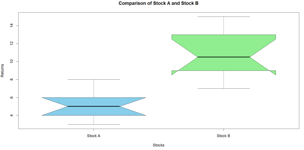
A good practice is to compare the box plots of both stocks so we have good visual comparison of the data distribution and variability. Some of the uses are to compare the volatility of two investments to assess risk-to-reward, analyze variability in supply chain demand patterns, compare measurements (e.g., blood pressure, glucose levels) from different groups.
Boxplots visually confirm the risk-to-reward trade-off between the two stocks. A stock with:
- Smaller IQR → More stable, less variable.
- Higher median → Higher returns.
- Fewer outliers → Fewer extreme risks.
boxplot(stock_A, stock_B,
names = c("Stock A", "Stock B"), # Labels for the boxplots
col = c("skyblue", "lightgreen"), # Colors for boxes
main = "Comparison of Stock A and Stock B",
ylab = "Returns",
xlab = "Stocks",
notch = TRUE) # Notches for median comparison

6. Range
The difference between the smallest and largest number in a set of data i.e., xmax – xmin.
max(mtcars$mpg) - min(mtcars$mpg) # 23.5 
